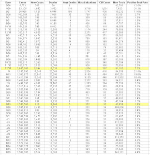
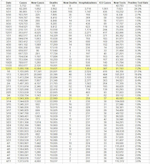
Case Analysis per 100,000 Cases
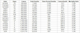
Did an interesting chart that shows the progress of the Covid situation over time.
I broke it down into chunks of 100,000 cases. The cases per death and mortality rate was much higher in the beginning, then it got much better, but has recently regressed back to earlier badness.
When we were doing our best, the mortality rate was down to 0.2%, which is very good. Recently that's ticked up to where it's now back up to 1.3%. In the beginning it was at 7.3%.
At one point were were only having one death every 487 cases. That's gone back to one death for every 77 cases, which is not good.


Comments
Post a Comment